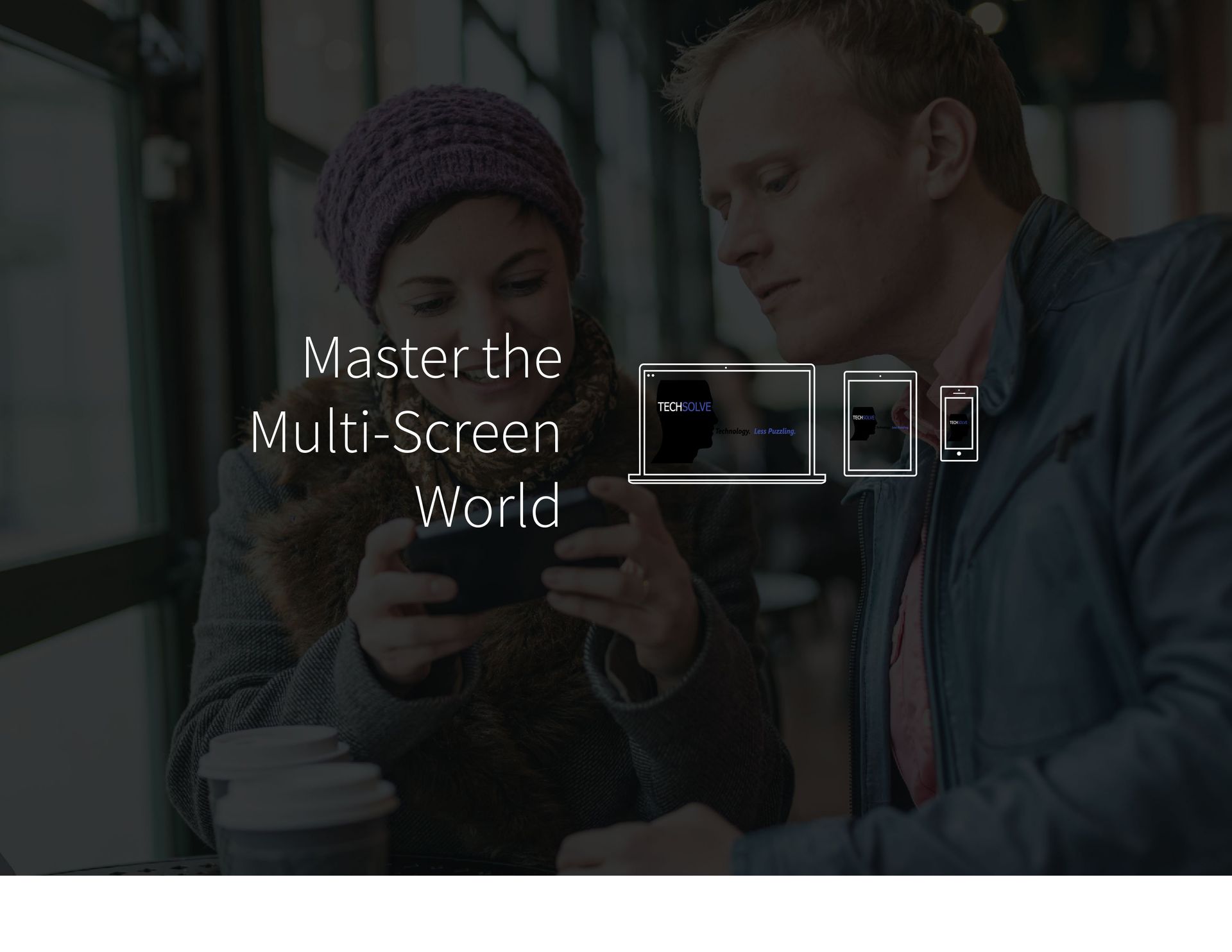
Multi-Screen Web Design
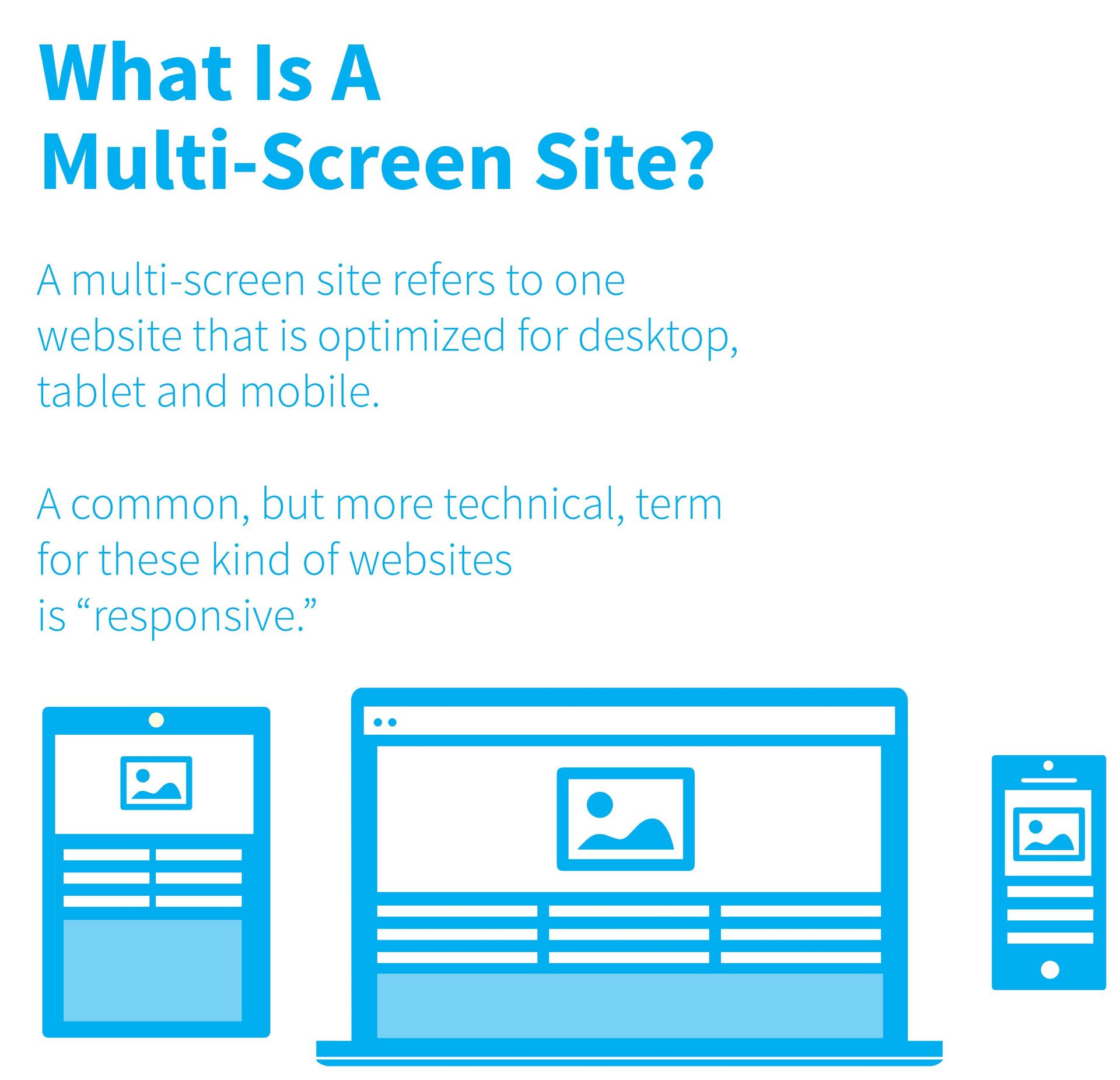
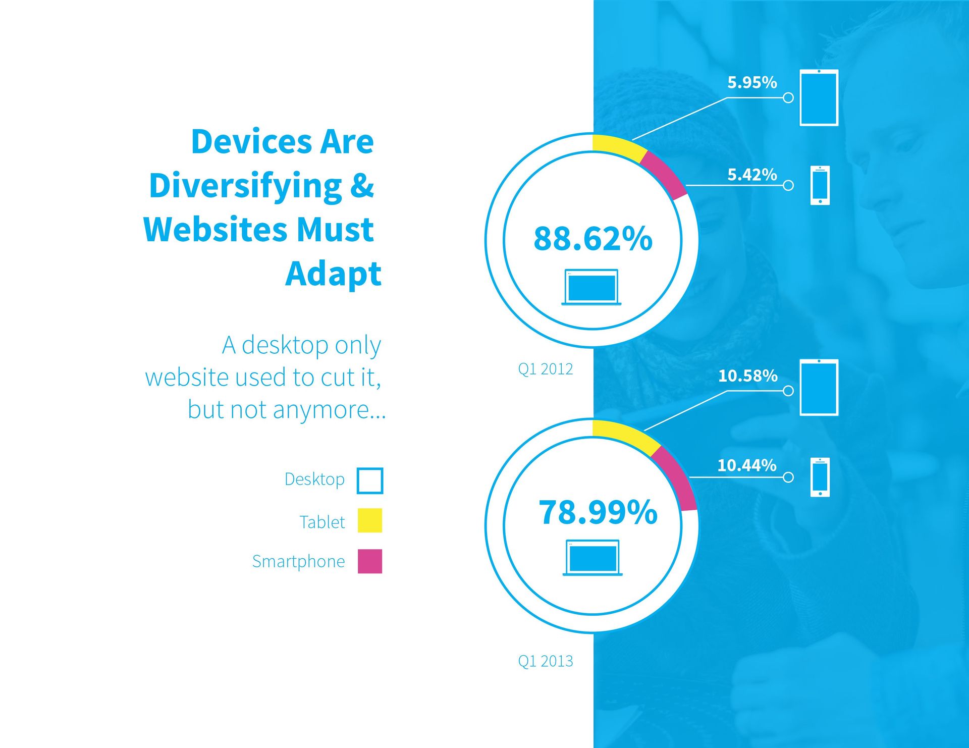
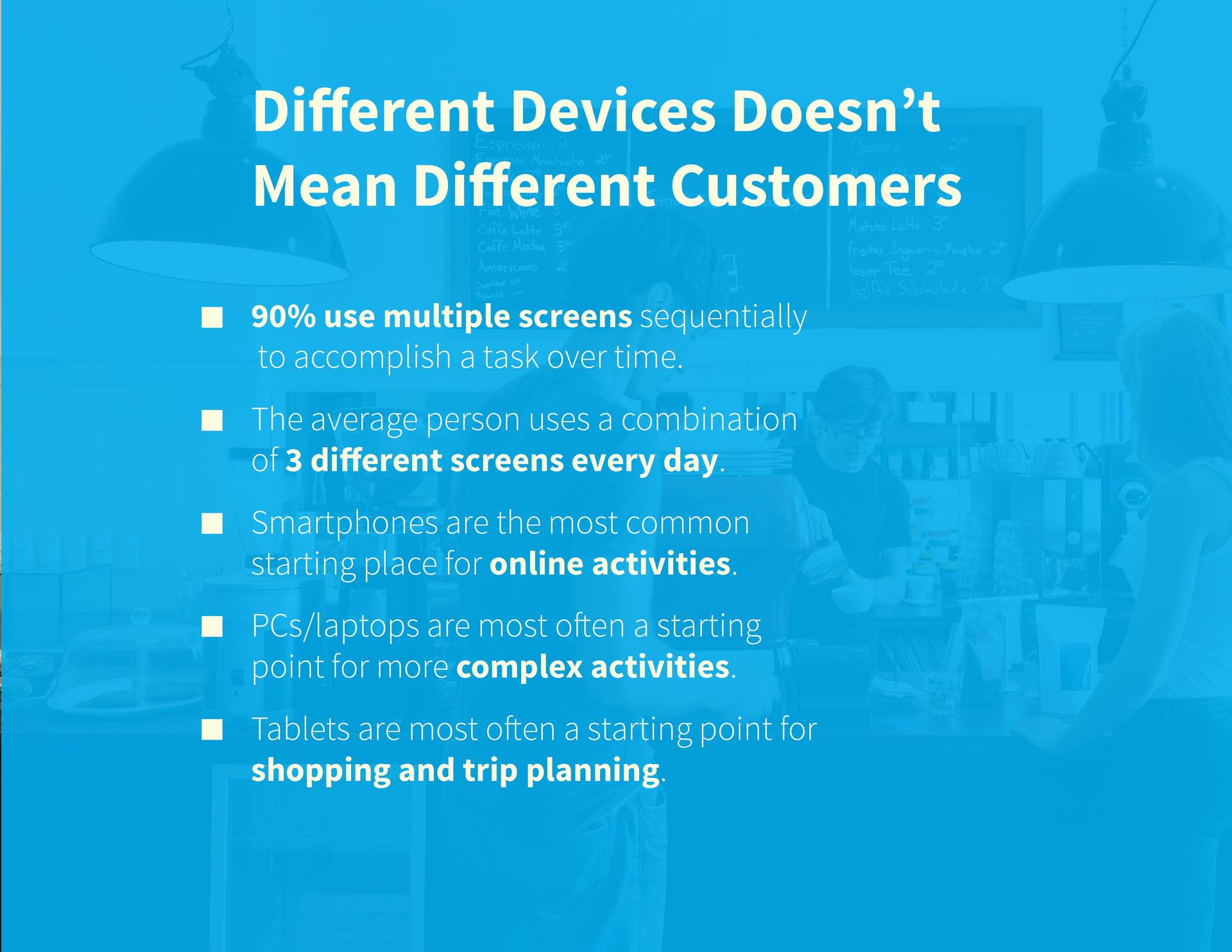
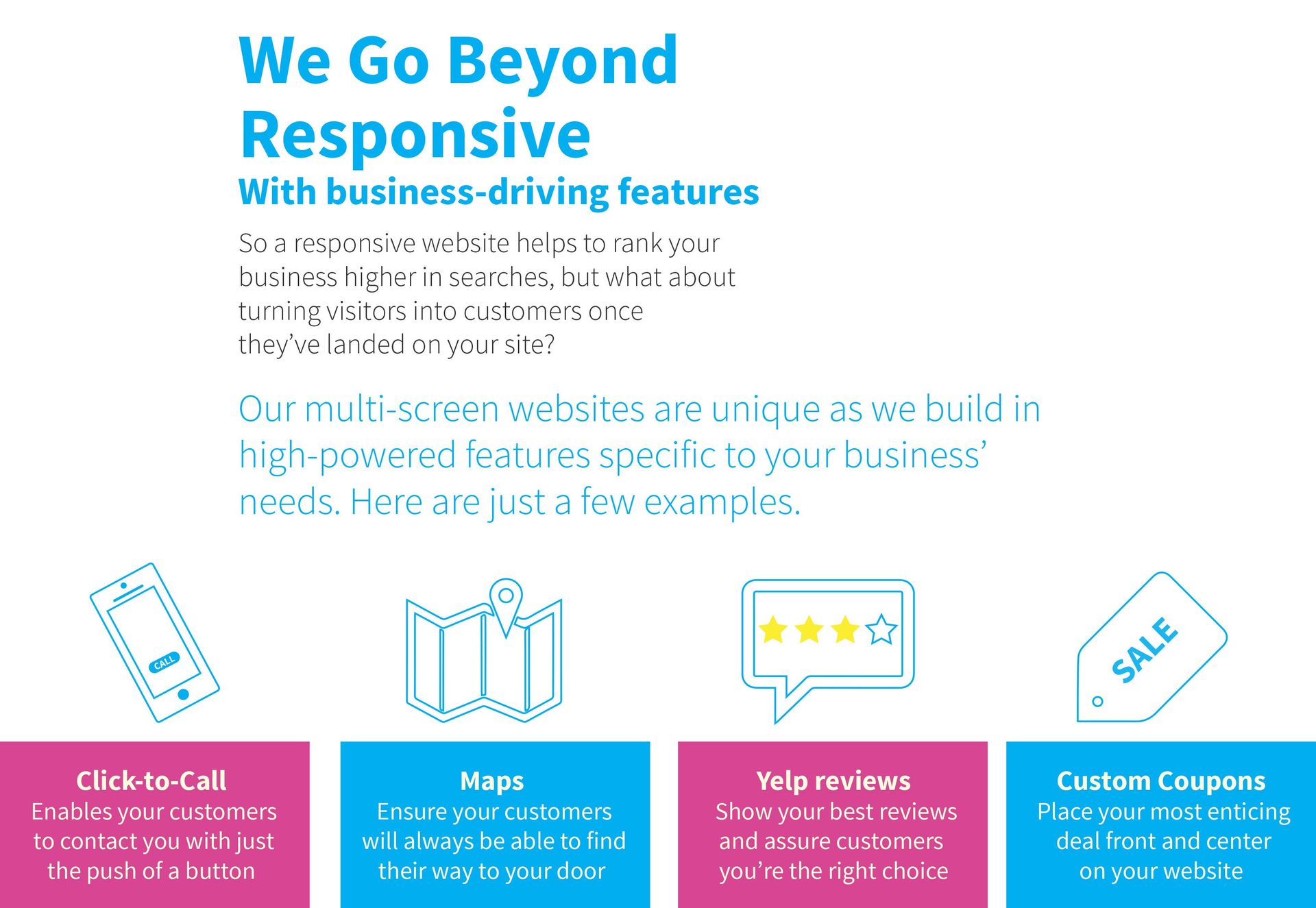
A multi-screen site (also know as "responsive") refers to one website that is optimized for desktop, tablet and mobile. Different devices doesn't mean different customers:
- 90% use multiple screens sequentially to accomplish a task over time
- The average person uses a combination of three different screens each day
- Smartphones are the most common starting place for online activities
- PCs/laptops are most often a starting point for more complex activities
- Tablets are most often a starting point for shopping and trip planning
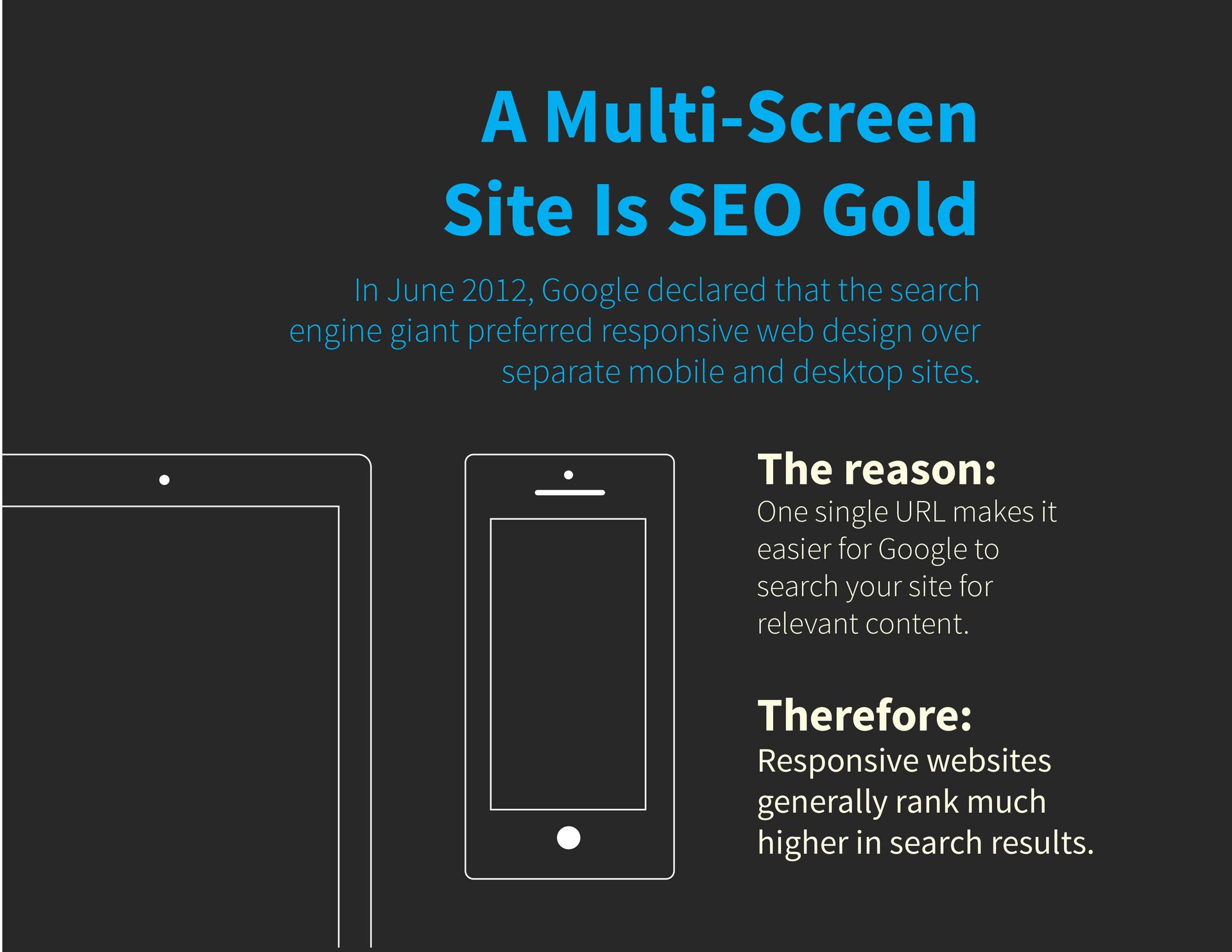
A Multi-Screen Website Is SEO Gold
In June 2012, Google declared that the search engine giant preferred responsive web design over separate mobile and desktop sites.
THE REASON
One single URL makes it easier for google to search a site for relevant content
THEREFORE
Responsive websites generally rank much higher in search results
Mobile Sites
Long Story Short if they are happy with your site, mobile customers mean business 73% of mobile searches trigger an additional action like making a call of visiting your business
Your customers are already using mobile 64%, an impressive 2/3 of all mobile phone owners now use their phone device to access the web.
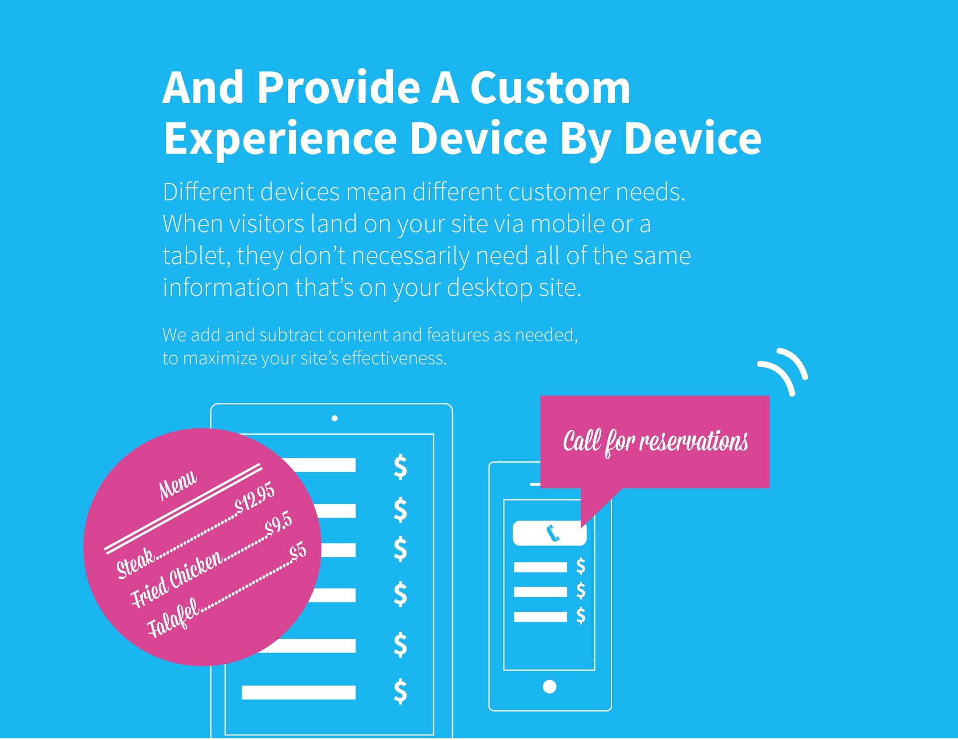
Dynamic Content Personalization
Though it sounds a little complex, the concept behind DWP is fairly straightforward: it's all about creating a website experience that directly relates to a visitors unique situation.
This is accomplished by changing the messaging and content of a website based on things like time of day, number of previous visits to the site, visitor's location and more.
For more ways dynamic content can be used for your website we create a downloadable .pdf file click here.

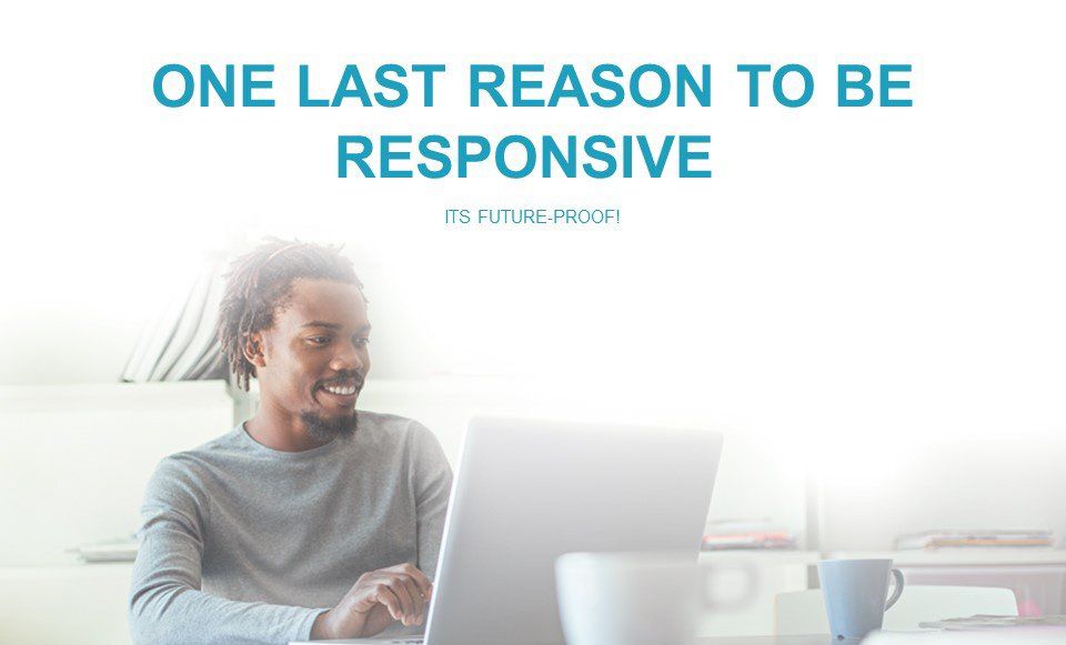
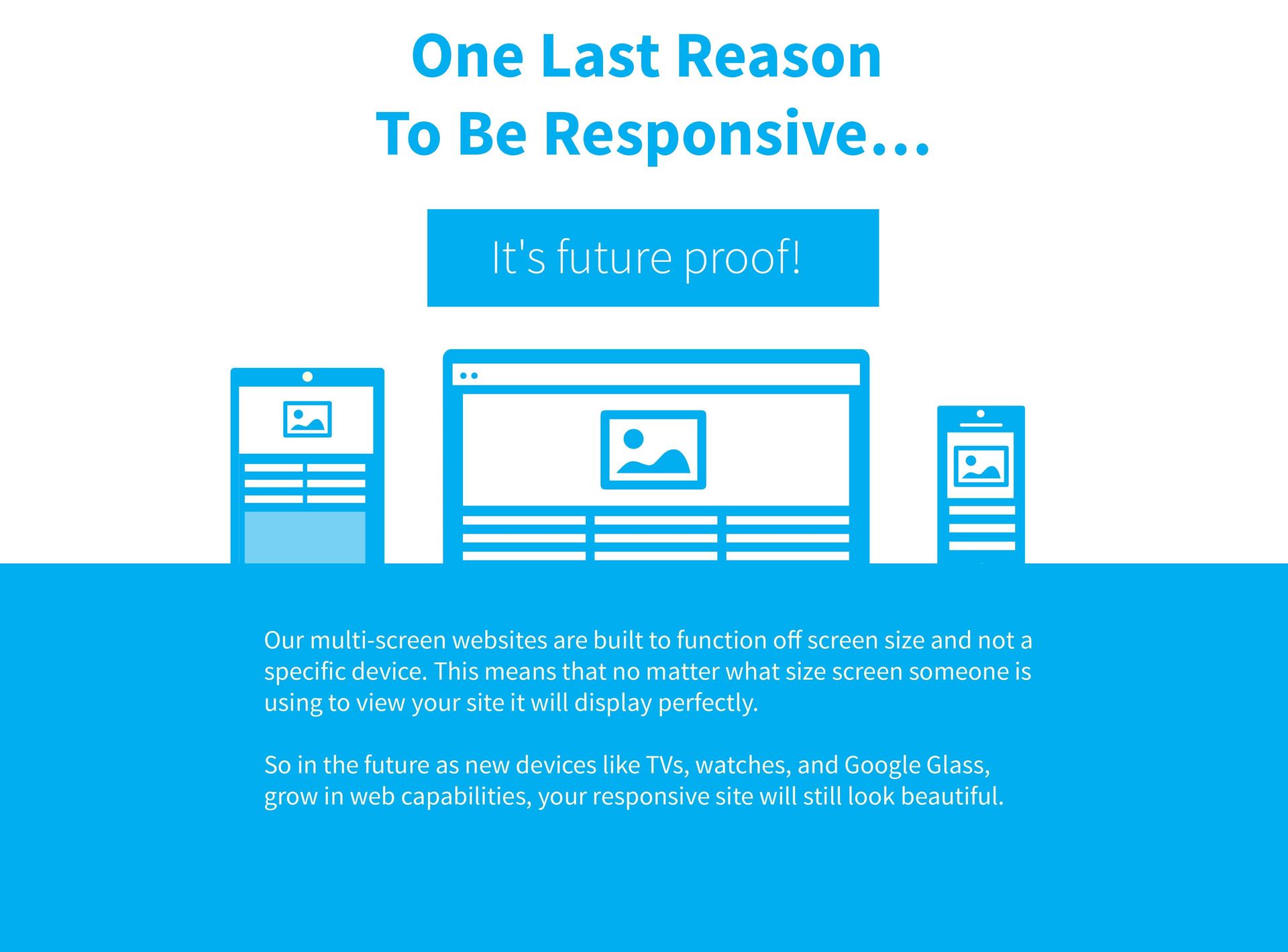
Our multi-screen websites are built to function off screen size and not a specific device. This means that no matter what size of screen someone is using to view your site it will display perfectly.
So in the future, as new devices, like TVs, watches and Google Glass, grow in web capabilities, your responsive site will still look beautiful.
All of Techsolve's web design is done locally here in Windsor, ON. We do not outsource any of our work and are 100% locally owned and operated. When you hire us to build your website you get to meet one on one with your website designer. So if you're interested in a website be sure to contact us for your free consultation.